Saravanan M, Technical Architect, Quadwave
The Concept of Google Material Design
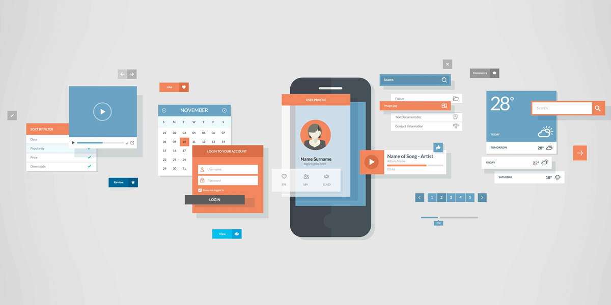
In the beginning of the year 2016, the concept of material design was wowing the IT industry due to its flexible features. Material design, a new visual design language developed by Google, comes with comprehensive design guidelines for the user interface (UI) elements on each and every aspect of the design. It includes color, font, size, animation etc. Material design got implemented on mobile devices in the beginning; however, it got extended to other devices like desktops, tablets, smartphones, smart TVs, and smart watches.
Top Three Material Design Principles
- Material is the Metaphor
- Bold, Graphic, and Intentional
- Motion Provides Meaning
- Material is the Metaphor
The first principle, Material is the Metaphor, was inspired by the study of paper and ink. The idea of layering elements in the UI was not a new concept and it was implemented earlier as part of Windows Presentation Foundation and Silverlight technologies. However, Google Material Design takes it one step further by combining with the second principle (Bold Graphic and Intentional).
- Bold, Graphic, and Intentional
The second principle provides print-based design, which includes size, color, typography etc.
- Motion Provides Meaning
Every object responds to the user actions, revolves around physics, and follows a systematic approach towards the design. Material design is a design language, which can be utilized for developing applications in multiple devices like desktops, tablets, smartphones, smart TVs and smart watches.
Material design is not just a decorative concept, it also improves the accessibility of the product. Easily accessible design allows the user with restricted physical abilities (i.e., people with low vision, blindness, hearing impairments, cognitive impairments, or motor impairments), to navigate, understand, and use the UI successfully.
Accessible design uses three core principles.
Clear – Clearly visible elements in contrast and size.
Robust – Screen reader program that uses a speech synthesizer to read the text.
Specific – Support for the inputs like touch, keyboard, and mouse depending upon the platform.
Material design offers an appealing interface for the users. It’s the time to build material design apps. Start building!